New look
I'VE DONE away with the two-column template with the drop cap—I will miss it, of course, but it limited what I can do with the photographs. I want the photos big. So I've shifted to a single-column minimalist design, adapted from Wordpress's Twenty and One classic theme. I've missed having a side-bar. Not that anyone cares; tweaking with the code has brought me back to the days when I'd kill time by learning html and CSS. I remain an amateur in that respect. I've decided to settle with a text instead of an image header. Minimalism, yo.
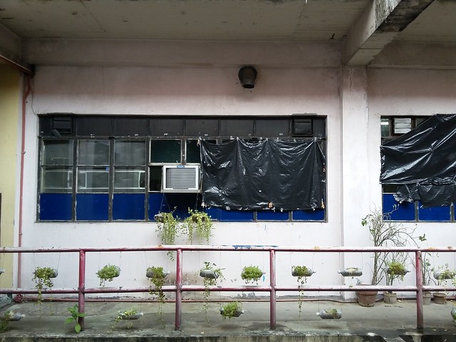
Meanwhile, below is a photo of what I call The Hanging Gardens of the Burn Unit at PGH. Not the most beautiful garden there is, but people in these parts do what they can.
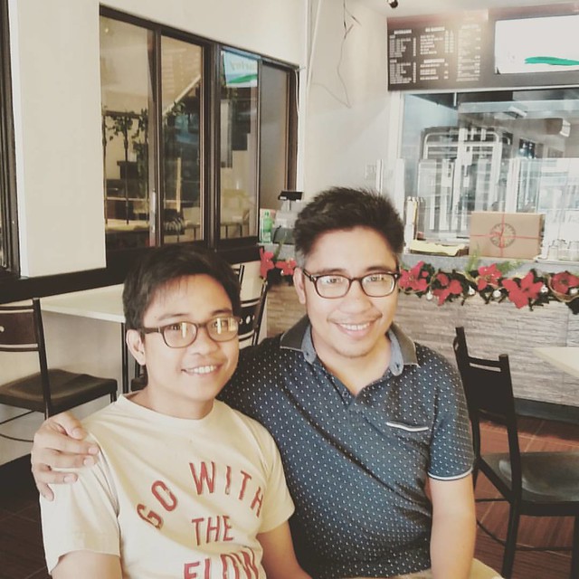
Also, here are my pabebe brothers, both with bulging flanks—yet another proof that one can't escape genetics. The Catedral body phenotype: bulging at the poles, flattened at the equator. You should look at my father. And may I add—as I hope it applies to how we construct our sentences—short and sweet?
Meanwhile, below is a photo of what I call The Hanging Gardens of the Burn Unit at PGH. Not the most beautiful garden there is, but people in these parts do what they can.

Also, here are my pabebe brothers, both with bulging flanks—yet another proof that one can't escape genetics. The Catedral body phenotype: bulging at the poles, flattened at the equator. You should look at my father. And may I add—as I hope it applies to how we construct our sentences—short and sweet?

2 Comments:
I miss the sidebar, too. (Yes, someone cares!)
==
The garden looks so sad but at least it exists...
==
Wow, is Ralph already getting that distinguished gray at the sides of his head? Sean looks really young.
Thanks so much. Natawa po ako doon sa "Yes, someone cares!"
Yes, that's a natural gray; I've argued against him getting it dyed.
Post a Comment
<< Home